

ATLAS

Project Overview
UI/UX Design
ATLAS is a new system created by the U.S. Department of Education (DOE) to make managing special education cases more efficient and accessible. It’s designed to simplify how Individualized Education Programs (IEPs) and related documents are handled, helping educators and families better support students with special needs.
My Team
Michelle Jiang
Intent
Design the UI for the evaluator assignment and management module in ATLAS.
My Roles
UI/UX Design
Background
ATLAS is the new system being introduced by the Department of Education (DOE) in New York to replace SESIS, which has been the tool for managing special education cases for years. ATLAS offers a more streamlined, user-friendly platform that simplifies the management of Individualized Education Programs (IEPs) and related documentation, with a clearer, easier-to-follow user experience compared to SESIS. It provides real-time data access, enhanced collaboration tools, and improved compliance with legal requirements like IDEA. By integrating advanced features and a more intuitive interface, ATLAS aims to reduce administrative burdens, improve communication between educators and families, and ensure that students with special needs receive more effective and timely support.
Delivery Process
ATLAS is a complex system with multiple modules and a large team, where every design change must be intentional and mindful of user needs. As a UI/UX designer on this project, I collaborated closely with Business Analysts and Subject Matter Experts (SMEs) to ensure my wireframes incorporated all the necessary business requirements and data, while providing a seamless and intuitive user experience. The process of handing off wireframes to the development team is rarely linear and often involves several iterations. I led prototype presentations with stakeholders, collected feedback on both the design and process, and made sure the functionality met the intended objectives and accessibility standards before handing off the final designs.

Research
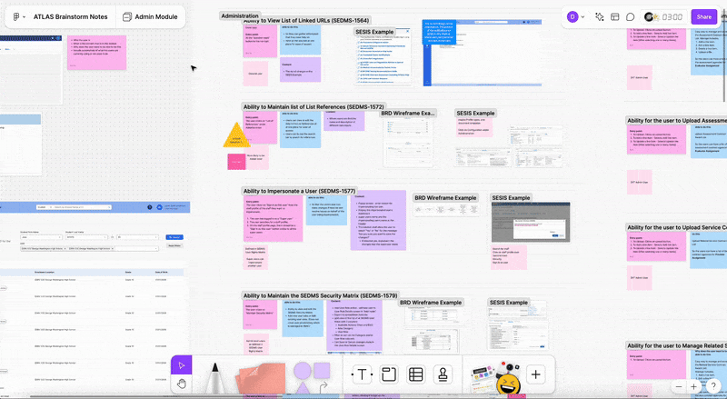
Having a thorough understanding of the module’s Business Requirement Documents (BRDs) is essential for designing an effective user interface, which is why I always take the time to carefully read through and take notes on each BRD before I begin my low-fidelity sketches. Below are some examples of my research notes. In addition to documenting the intended user, purpose, and function of each feature in the BRDs, I also included current examples from the previous program, SESIS, and gathered user feedback on those features to help guide my design decisions.


Wireframes & Iterations
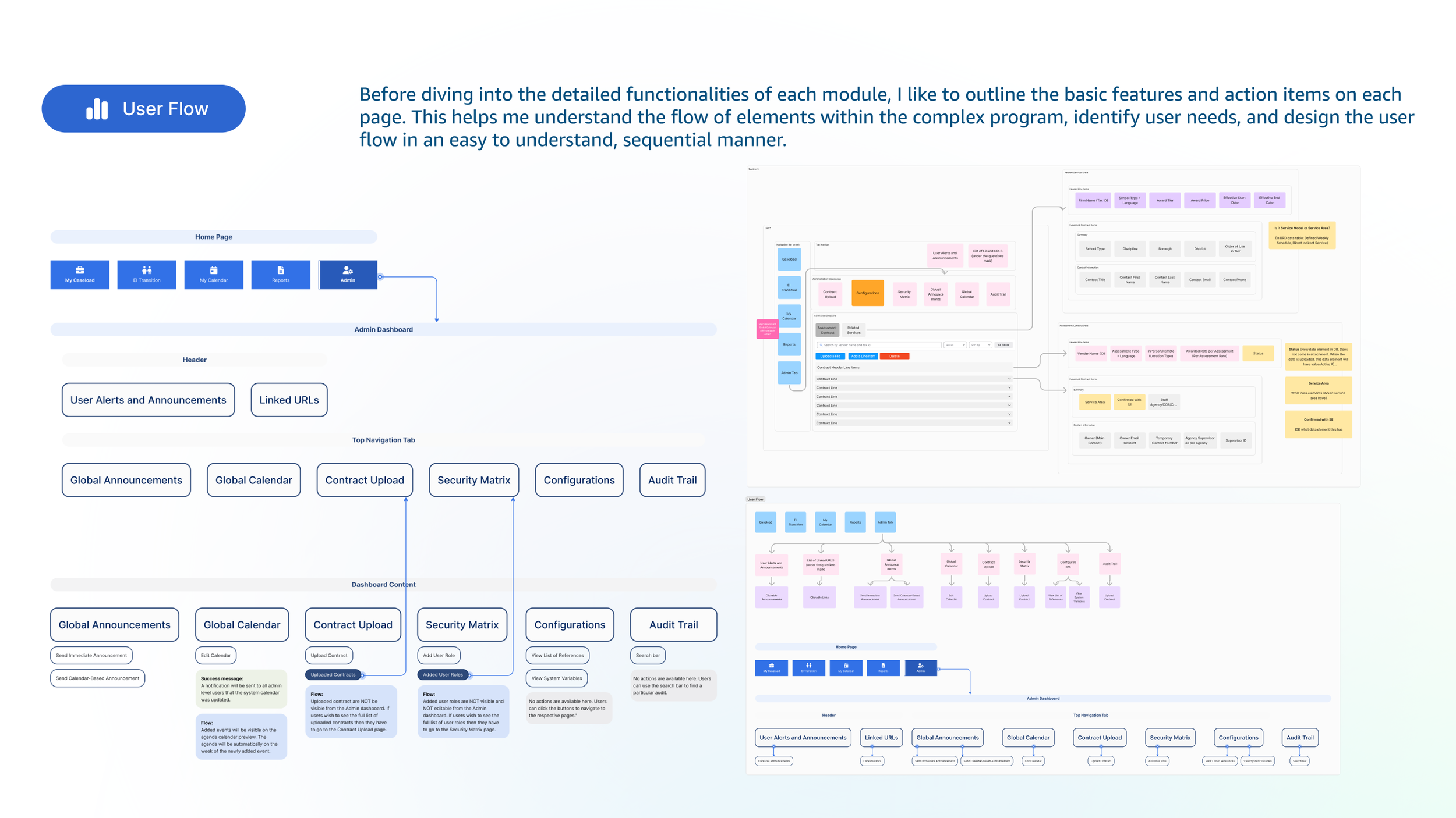
In my wireframe designs, I placed a strong emphasis on clearly labeling each entry point (if applicable) for all of the business-required features. This approach helps me organize my ideas and user flow, especially when tackling more complex designs and edge use cases later in the process.


Prototype Presentations
Once the wireframes were internally aligned with the BAs, I would lead prototype presentations with stakeholders, and gather feedback on the process and design. All of the proposed UX changes and future requests are recorded in a spreadsheet with the date, details, and the person who suggested the UX changes.

Dev Handoff
After the wireframes are finished, I would usually perform a final internal review to ensure full alignment within the team. Once that’s done, I create a separate wireframe file specifically for development handoff. This version includes clear labels for pop-ups and hover states, active links, directional arrows guiding developers to the appropriate components, and detailed development notes for complex sections.


