Case Study · 2025–2026
Nexxen DSP: Rebuilding the Token Foundation for a Platform at Scale
Modularized a legacy design system into a scalable 3-tier Figma token library with 200+ components, consolidating 40+ hardcoded values and enabling rapid dark mode and white-label retheming across platforms.
Context
The product was scaling faster than its design language
Nexxen's DSP is a programmatic advertising platform used by agencies and brands to plan, buy, and measure media. The product had grown significantly over several years, and the design had kept pace the only way it could in a fast-moving team: by adding. New components when something was needed. New colors when the brand evolved. Hard-coded values because there was no other infrastructure.
By the time I was brought in to lead this effort, the system had accumulated over 40 unique hard-coded color values with no unified naming convention. Dark mode had been a product request for two cycles but no one knew how to implement it without touching every screen by hand. White-label retheming for enterprise clients was theoretically on the roadmap and practically impossible. The design system was not broken. It had never been built.
"The problem was not the individual color choices. Most of them were actually good. The problem was the absence of structure underneath them. Without a token layer, every new surface had to make the same decisions from scratch, and every brand change had to be applied manually to hundreds of components."
The business case was clear once you traced the costs: design velocity slowed by repeated decision-making, engineering velocity slowed by inconsistent specs, enterprise features blocked by the absence of a theming infrastructure. This was not a design problem. It was a product problem that design had the unique ability to fix.
Audit
Audit before architecture
Before proposing anything, I ran a full audit of every component, every color value, and every spacing instance across the three main product surfaces. The goal was to understand actual scope before committing to an approach. Pitching a solution before the audit would have been guessing.
The audit surfaced the hard numbers: 40+ unique hard-coded color values where there should have been fewer than 15 semantic tokens. Typography had six variations of the same body style, defined differently depending on who had last touched that surface. Spacing was applied inline with no shared scale. Components that looked identical to users were built completely differently in Figma depending on who made them.
The audit also revealed something useful for the pitch: despite the inconsistency, roughly 60% of the visual decisions were already correct. The existing color choices, type scale, and spacing rhythm were solid. This meant I was not proposing to throw everything away. I was proposing to give existing good decisions a structure that would make them maintainable, extensible, and themeable.
That reframe changed the conversation with stakeholders. The proposal became: take the design language you already have and make it work for every future surface you want to build. Not starting over. Making permanent.
Process
Six stages, built in sequence
The system was built in six sequential stages, each one a prerequisite for the next. Skipping ahead would have meant building on an unstable foundation.
Audit
Catalogued every existing color value, spacing instance, typography style, and component state across the three main product surfaces. Built the evidence base for the architecture proposal.
Primitives
Created seven tonal palettes on a 0–100 luminance scale with no semantic meaning attached. Pure values only. These are the raw material the rest of the system references.
Semantic tokens
Assigned specific palette stops to named roles: primary, on-primary, surface, error, and so on. This is the layer that makes theming possible and the layer components reference directly.
Typography
Established an eight-size scale with context-based semantic naming from Metadata Limited (12px) to Hero Title (42px). Weights and line heights normalized across all sizes.
System layers
Defined surface hierarchy, graph and data visualization color assignments, and interaction state standards (hover, focus, disabled, error, loading) across every component category.
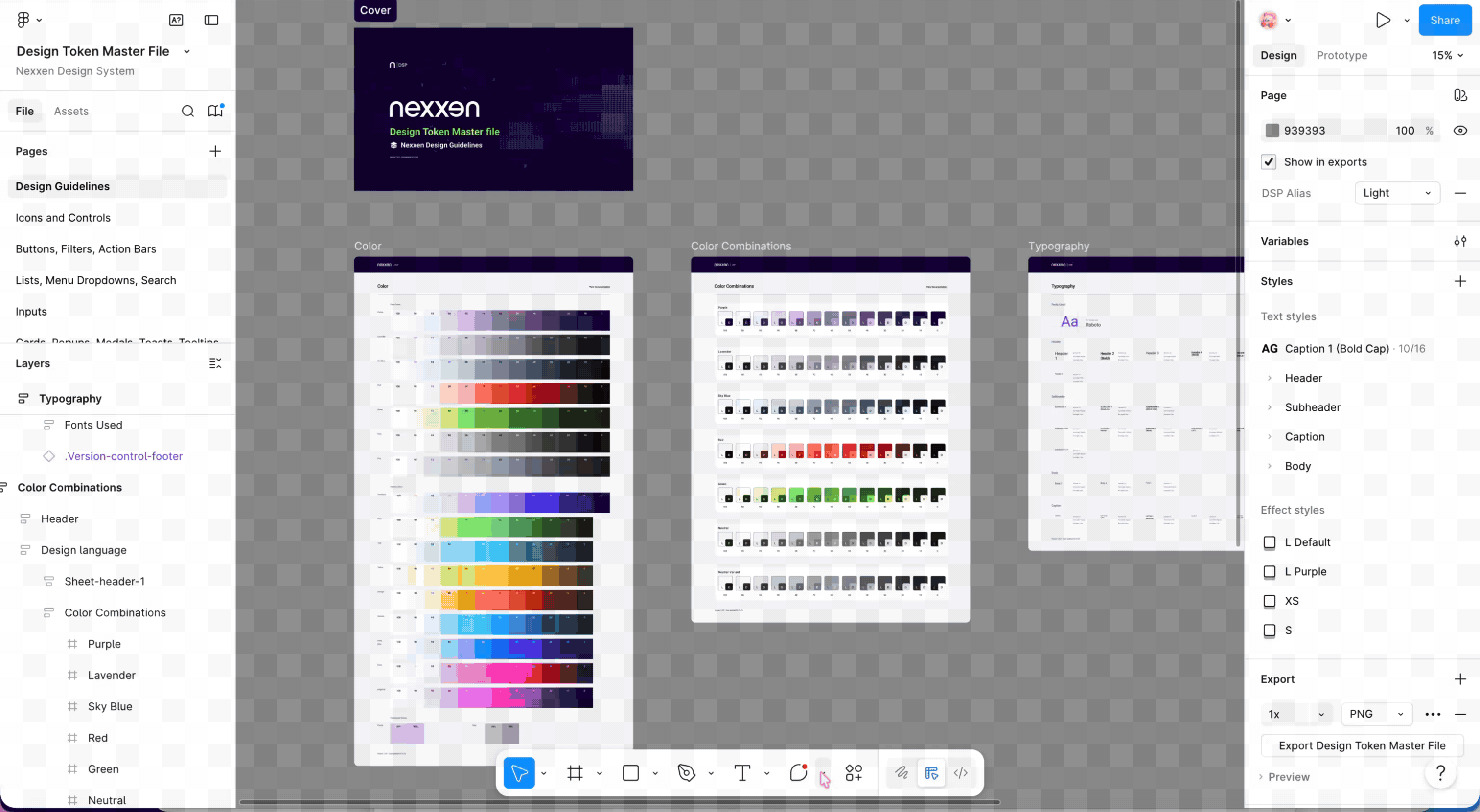
Documentation
Built versioned living documentation directly inside Figma, inline with each component. Usage guidance, edge cases, and token annotations available to any designer without leaving the file.
Architecture
Three tiers, one source of truth
The core of the system is a 3-tier token structure built in Figma Variables, designed in parallel with engineering's naming conventions so design and code could stay in sync from day one.
Tier 1 · Primitives
The raw palette. Every literal color value in the system, organized into seven
tonal scales on a 0–100 range: Primary, Secondary, Information, Error, Success, Neutral, and Neutral Variant.
Each scale uses non-linear stops at 100, 98, 95, 90, 80, 70, 60, 50, 40, 30, 20, 10, and 0,
mirroring Material Design's palette structure. The 98 and 95 stops give fine-grained
control at the light end of the scale where most surfaces live. Primitives are named
by position, never by intent.
purple.40
is a color, not a decision. No component references a primitive directly.
Tier 2 · Semantic tokens
Named by intent, not by value.
color.primary,
color.on-primary,
color.surface,
color.error.
Semantic tokens point to primitives. Changing which primitive a semantic token
points to retranslates that intent across every component simultaneously.
This is the layer that makes theming possible. Swap the primitives that semantic
tokens reference and the entire product rethemes without touching a single component.
Tier 3 · Component tokens
Scoped to specific components where semantic tokens need further specificity.
button.bg.default,
button.bg.hover,
toast.error.bg.
A button's hover state and a card's hover state draw from the same semantic
family but need different values. Component tokens hold that nuance without
breaking the cascade, and their names map directly to CSS variable names in
the engineering component library.
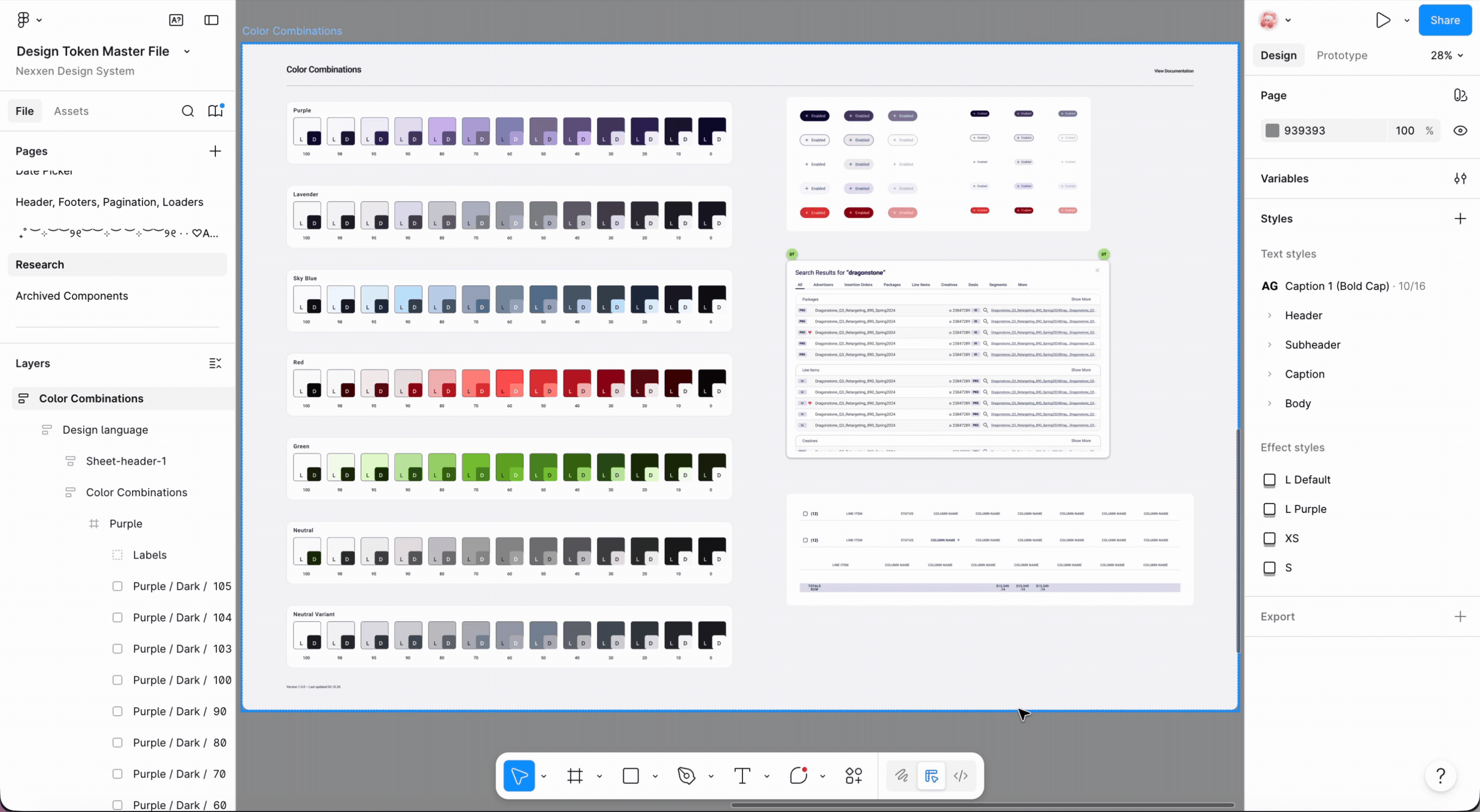
Color System
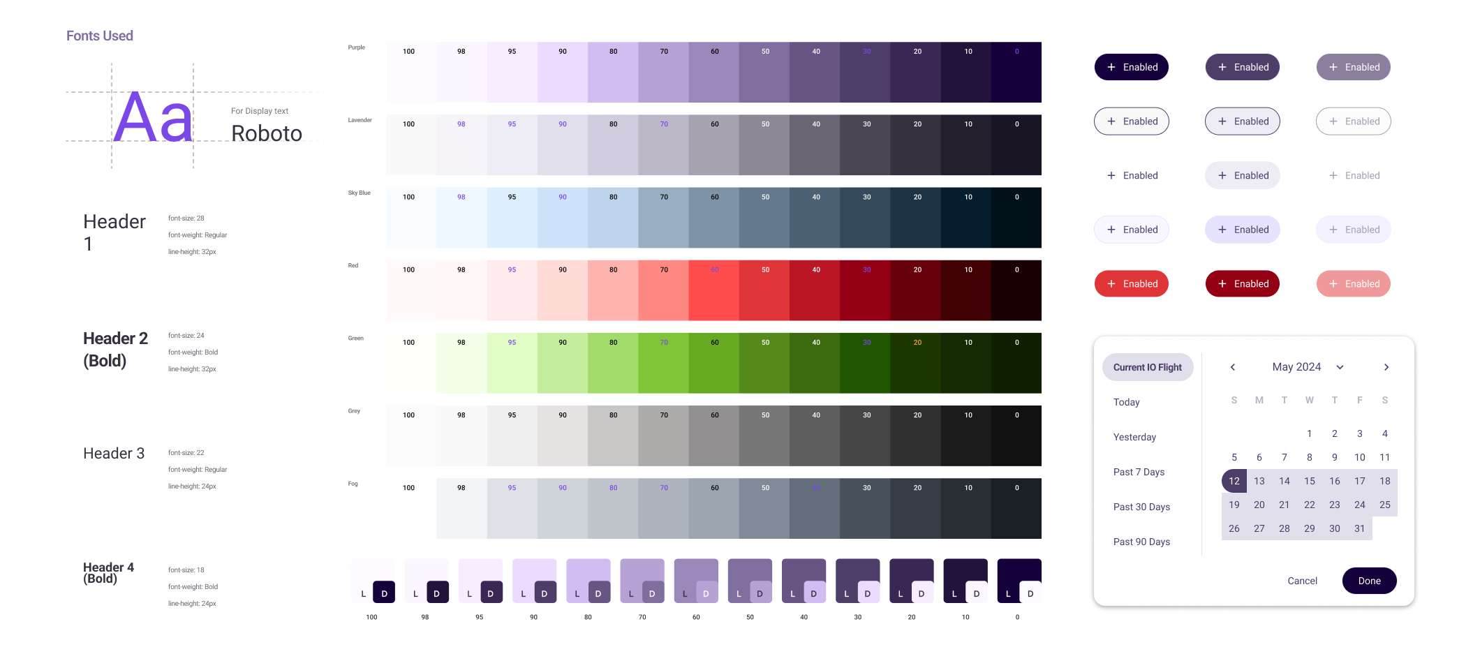
Seven tonal palettes, one shared grammar
The color system is built on seven tonal palettes: Primary, Secondary, Information, Error, Success, Neutral, and Neutral Variant. Each palette runs a 0–100 perceptual luminance scale with stops at 100, 98, 95, 90, 80, 70, 60, 50, 40, 30, 20, 10, and 0.
The non-linear stops were intentional. The 99 and 95 positions exist specifically to give subtle surface-level differentiation at the light end of the scale, where most of a data-dense UI lives. Without those stops, light backgrounds either collapse into white or make too large a jump to the next shade. In a platform where surface hierarchy does significant information-organization work, that granularity matters.
Exact values from the Figma Design Token Master File.
The palette-level naming uses semantic abstraction:
primary
rather than
purple.
This was a deliberate product decision: if Nexxen's brand ever changes its primary
color, the semantic layer absorbs that change. Nothing downstream needs to know that
primary used to mean purple. The system is built to outlast the brand decisions made
when it was created.
Typography
Eight sizes, semantic names
The typography system uses eight named sizes with context-based semantic naming. Sizes range from Metadata Limited at 12px (dense data labels and table metadata) to Hero Title at 42px (top-level dashboard headings and empty states). Every size in between is named for its intended context, not its raw value.
The advantage is the same as semantic color tokens. Components reference
type.body.default
rather than
14px.
When the type scale needs to change for a new platform density requirement, the token
value updates and every component follows automatically.
Engineering
Aligned with engineering from day one
The first two weeks were spent with the engineering team, not in Figma. I needed to understand how the existing codebase was structured before designing a naming convention, because the system only works if design and code speak the same language. A token structure that does not map to the engineering token structure creates a translation cost on every handoff. That cost compounds across every component and every sprint.
We aligned on naming conventions, tier structure, and the mapping between Figma
Variables and CSS custom properties. For example,
color.primary.default
in Figma maps directly to
--color-primary
in the codebase. We also aligned on the export format so that when tokens changed
in Figma, engineering could pull updates through a consistent pipeline rather than
manual reconciliation.
"The naming convention was the most important design decision in this project. It determined whether the system would stay in sync with engineering or drift apart the moment handoffs started. We decided together, before I wrote a single token."
Once the core component set was stable, I ran onboarding sessions with the other designers. The goal was not to teach a tool. It was to explain the mental model, so designers could extend the system correctly rather than work around it. A shared Slack channel for component requests and questions meant the system could evolve without me as the single point of contact. By the end, two other designers had contributed new components that followed the token structure correctly without needing my review. That was the real measure of success.
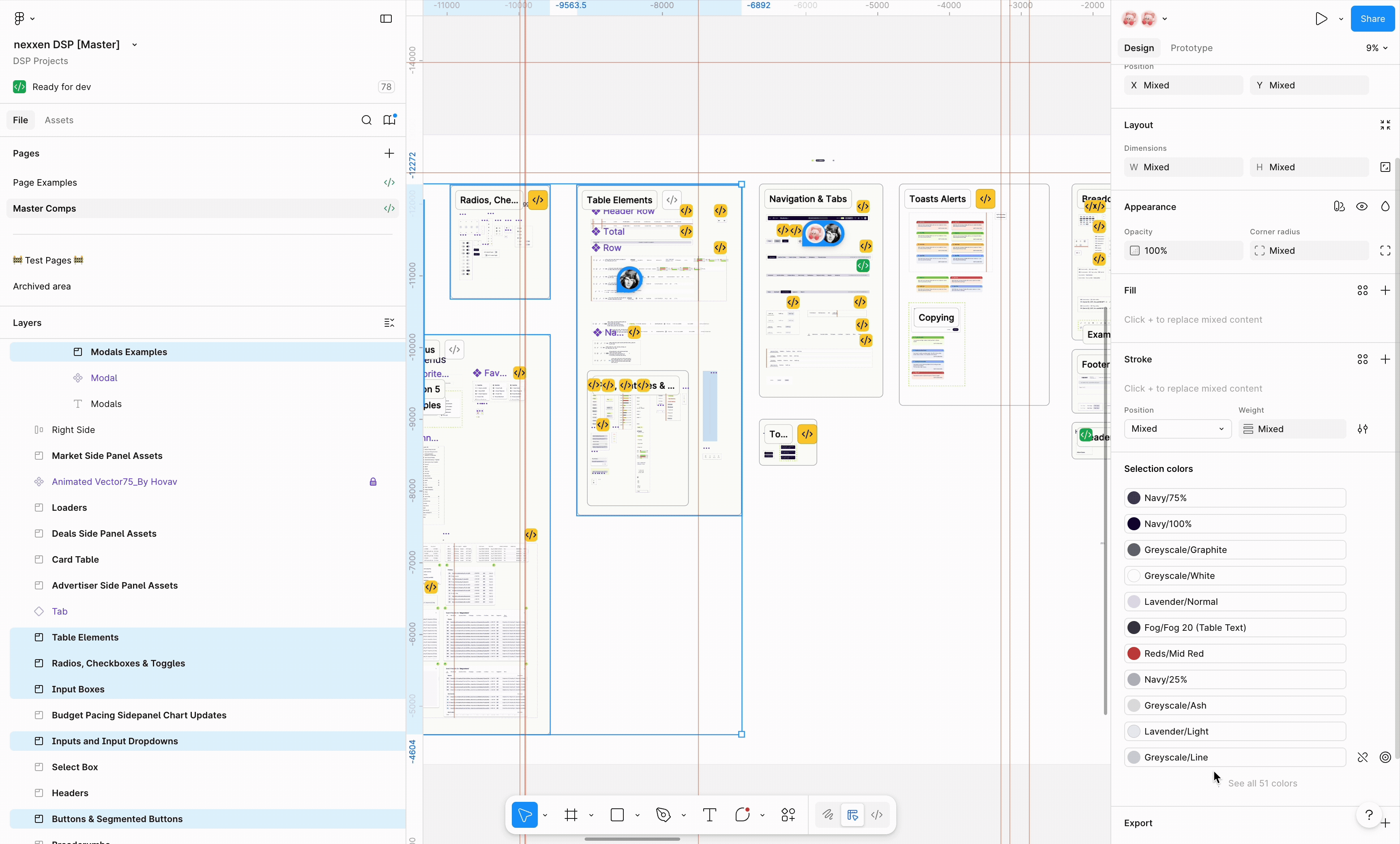
Components
Rebuilding the component library
With the token architecture defined and validated with engineering, I rebuilt the component library from scratch. Every component consumes tokens, never raw values. If a component needed a value that was not in the token system, that was a signal to add a token, not to hard-code.
I prioritized by usage frequency: form elements and data tables first because they appear on almost every screen in a DSP, then navigation and layout components, then specialty components. Each component was built with full state coverage: default, hover, focused, disabled, error, and loading where applicable.
Documentation lives inline in Figma, not in a separate Confluence page. Usage guidance, edge cases, and token annotations are visible the moment any designer opens a component. Documentation in a separate document gets ignored. Documentation that is part of the component gets used.
Theming
Dark mode in two hours
Once the token architecture was in place, dark mode was not a project. It was a two-hour task.
I created a dark mode primitive set, mapped it to the existing semantic tokens via a new Figma Variable mode, and every component in the library switched without a single component-level change. The semantic layer absorbed the entire swap. Two cycles of dark mode requests had been blocked for want of exactly this infrastructure. After the rebuild, it shipped in an afternoon.
White-label retheming for Nexxen's enterprise clients followed the same pattern. A client's brand palette mapped into a primitive set, and their theme cascaded through the entire product via Figma Variable mode switching. What had been scoped as a multi-week engineering project became a configuration task. The architecture had been designed to make this possible from the start.
Outcome
What the system made possible
The rebuilt system eliminated the bottlenecks that had slowed the team for two product cycles. Dark mode shipped. White-label retheming became configuration. New product surfaces could be built from existing components without re-deriving color and spacing decisions from scratch each time.
The less visible outcome was the change in team workflow. Designers stopped making one-off decisions about color and spacing because the system made the right decision available by default. Engineers stopped receiving specs with hard-coded values because the token names were in the components. Handoffs became faster because the shared language already existed.
Reflection
What I learned building this from scratch
Naming is half the work
The technical architecture is learnable. Finding names that are meaningful to both designers and engineers is where the real design thinking happens. Getting this right early prevented weeks of rework. Getting it wrong would have meant two parallel vocabularies that slowly drifted apart.
Three-tier abstraction is non-negotiable
Systems that skip the semantic layer and map values directly to components collapse under the weight of any theme change. The indirection layer is not overhead. It is the mechanism that makes the system worth having. Every hour spent on it saves days of future manual work.
Documentation is a product deliverable
The system is not complete when the components are built. It is complete when a new designer can onboard independently without asking for help. That bar is harder to hit than it sounds, and treating documentation as an afterthought makes it impossible.
The audit is the brief
The most valuable work in the project was cataloguing the existing hardcoded values before writing a single proposal. The audit defined the true shape of the problem. Without it, the architecture would have been designed for the problem I assumed, not the one that actually existed.
"Design systems work is invisible when it's working. The sign of success is not when designers praise the library. It's when engineers stop asking designers to clarify what a color means."