Exploration · 2022
Audio Reactive Visualizations
Generative visuals driven by audio analysis in TouchDesigner, built around Porter Robinson's "Shelter". The geometry reacts to live spectrum and beat data, making the music visible.
Concept
Making music visible
"Shelter" was the obvious choice for this project, and not just because of how well-known it is. The song has an unusually architectural quality to it — there are clear structural layers, a defined build, and a drop that hits with a lot of mass behind it. That kind of intentional pacing gives you real material to work with. A track with no dynamics would produce visuals with no dynamics.
The goal from the start was to make something that felt composed rather than random. Audio-reactive visuals can easily become noise — every value changing, everything reacting to everything, nothing reading as intentional. The constraint I set was that the visuals should feel like an interpretation of the song, something that could only exist as a response to this specific piece of music, not a generic spectrum analyzer dressed up with geometry.
Technical Approach
Geometry driven by frequency
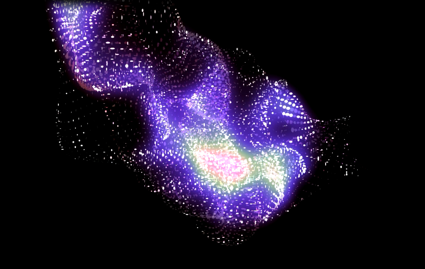
The signal chain starts with an audio analysis CHOP in TouchDesigner that breaks the incoming audio into frequency bands — sub-bass, bass, mid, and high. Each band produces a continuous value that changes in real time as the song plays. Those values are then piped into a subdivided plane geometry, where each band controls the vertical displacement of a region of vertices. The result is a surface that physically deforms in response to what's happening in the audio — low frequencies heave the geometry slowly, high frequencies create finer, faster movement across the surface.
Spheres are instanced onto the plane's vertex positions and inherit the displacement, so they ride the surface as it moves. Color is mapped separately: warm tones are tied to the sub-bass and bass range, cooler tones to the upper mids and highs, with the crossover point shifting as the song's energy changes. Beat detection from a Beat CHOP drives a global pulse on top of the spectrum-based motion, so the rhythmic structure of the track imprints on the visual rhythm separately from the frequency content.
Outcome
When the drop hits
The final piece builds the way the song builds. In the quieter sections, the geometry stays relatively flat — spheres drifting with the high-frequency shimmer, color sitting cool and muted. As the track moves into its pre-drop, the low-end information starts to dominate and the plane begins to heave in larger waves. When the drop hits, the displacement peaks, the warm palette floods the frame, and the beat detection fires consistently enough that the whole field pulses in sync. It reads less like data visualization and more like something breathing.
What this project made clear is how much of visual rhythm is about restraint. The interesting moments in the output aren't when everything is reacting — they're when one frequency band goes quiet and something else takes over. The relationship between audio and visual rhythm isn't about mirroring sound; it's about finding the right delay, the right scale, the right parameter to map so that the response feels earned rather than literal.